One-off logos
Various logos for start-ups, non-profits, corporations, and individually-own businesses nationwide
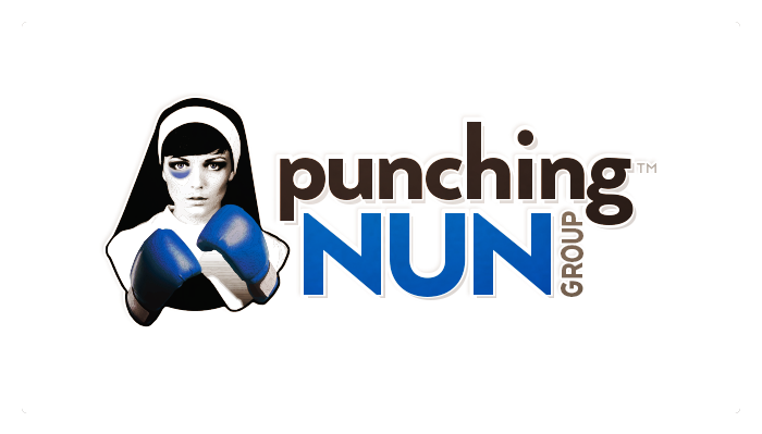
Corporate logo redesign for Middle Tennessee based plugin marketing company, Punching Nun Group™ for their ground-up corporate rebrand. This mark, the centerpiece of the corporate rebrand, had to mitigate all angles of potential offense that a compnay with such a name might stir up. I used a real model's face that conveyed seriousness rather than humor, as the previous logo had. And instead of a realistically-colored bruise—black, brown, or blue—I used Punching Nun Group's corporate blue so that the message would be that they are professionals with fight. [For more examples from this corporate rebrand, see http://thomasmcauleywriter.myportfolio.com/corporate-rebrand-punching-nun-group.]
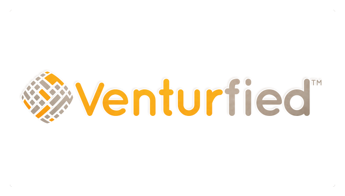
Corporate logo design for San Antonio based crowd-sourcing real estate startup company, Venturfied™. The logo mark is an abstraction of a topographical view of intersecting streets and structures, fish-eye focused, and the best properties highlighted in/symbolized by the use of Venturfied™'s corporate orange.
Technically still in the finishing-up stages, this logo reflects a design direction that I'm not afforded as often, given the healthcare-centric nature of much of my business. This is a refreshing minimalist logo for a couple of young real estate agents who needed a clean, simply , and modern logo to represent their generation and early morning energy.
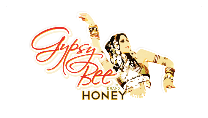
Corporate / product logo design for rebrand of Tennessee based honey company, Gypsy Bee Brand® Honey. As with Punching Nun Group's logo / corporate rebrand, to mitigate potential offense, I opted for a positive, powerful, cultural representation of the Roma / Romani culture. The dynamic posture of the dancer matched the dramatic red type of the brand name.
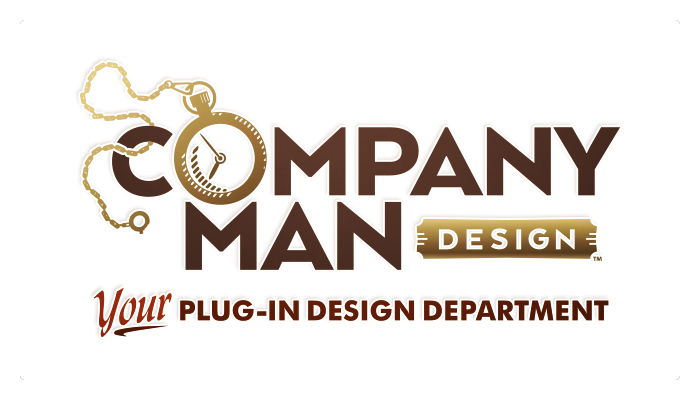
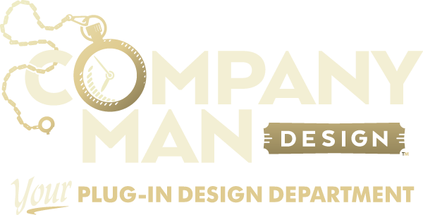
Corporate logo design for myself in support of my transition from marketing myself as an independent contractor to marketing my services as a company under the assumed name (DBA) of Company Man Design. The goal of the logo design was to communicate my conservative approach to design and my reliability, work ethic, and loyalty to the client as if they were my life-long employer, qualities that I believe separate my way of doing business from my competitors. See more by clicking About Company Man Design.
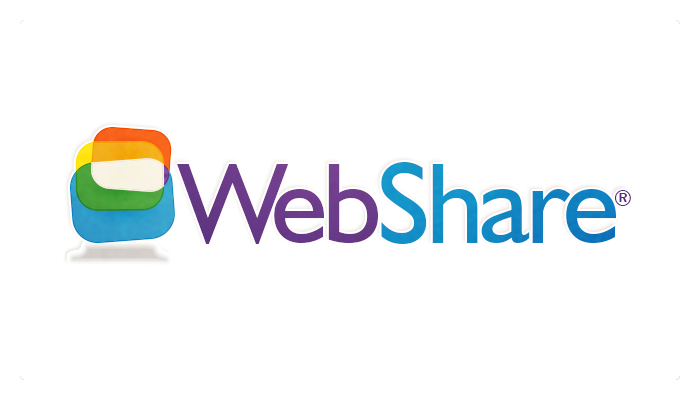
Corporate logo design for California-based tech startup company, WebShare®. The logo mark was symbolized the overlapping of multiple screens, a reference to the service the company provided.
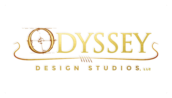
Corporate logo design for San Antonio based architectural design company rebrand. The logo's mark elements are perhaps obvious references to the ships of the Hellenistic period of Greek history. The "O" is lifted from actual Roman architectural plans. The gold type effect is clear. And the divider between the corporate name and its segment identifier with its characteristic ends and aligned paddles is an abstraction of the heavy ships from that time.
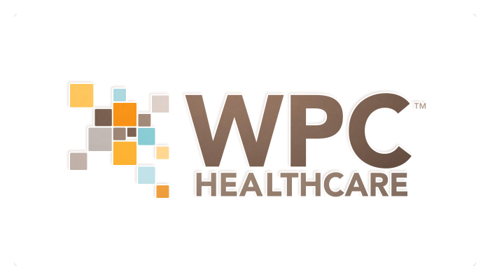
Corporate logo design for Tennessee-based healthcare data company, WPC Healthcare™
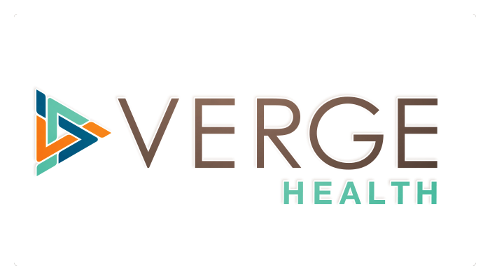
Corporate logo design for Mt. Pleasant, South Carolina based healthcare software company's ground-up corporate identity rebrand.
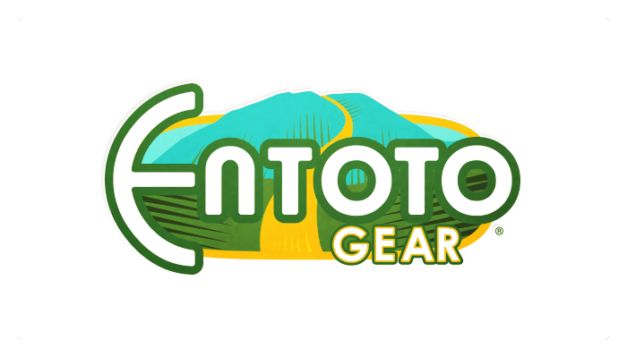
Corporate logo design for non-profit company, Entoto Gear®, which benefits women in Africa. The logo is an abstraction of Mount Entoto in Ethiopia, the location where women carry huge loads of sticks miles back and forth to earn a barely living wage.
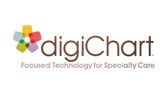
Corporate logo design for California-based healthcare tech/data company. The logo mark was an abstract representation of the comparison of divergent data sets into a beautiful harmony.
Corporate logo design for Austin, Texas based massage therapy business, Prime Therapeutic Massage. The mark and type choice were designed to convey femininity and relaxation.
Corporate logo design for female-owned Tennessee based healthcare consulting company, Worth Healing™